Showcase team members in Gutenberg editor following the best and easiest way, so that you can easily draw the attention of your customers to increase the loyalty of your business. If you are using Gutenberg block editor to design your webpage pages and are willing to showcase your team members, Gutenberg default blocks can’t satisfy your needs. In this case, a custom Gutenberg block can help you to showcase your team members easily.
In this article, I am going to share the whole process to showcase team members in Gutenberg using a custom Gutenberg Team Block. To go through the whole article, you have to install and activate a simple, lightweight, super-fast plugin, named Advanced Gutenberg Team Block. Simply install and activate the plugin.
Step-1: Add Team Grid to Gutenberg Editor
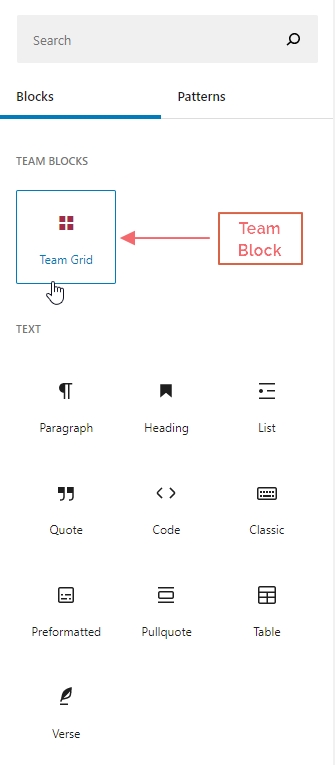
Once you finish the installation and activation of the plugin, now simply go to your expected page or post where you want to showcase your team members. When you land on the post or page, you will find a new custom block named Team Grid in the blocks library. It looks like the following screenshot-
Now simply click or drag the custom block to add to your editor. Once you add the block in your block editor, it shows 4 team members’ placeholder information. It looks like this-
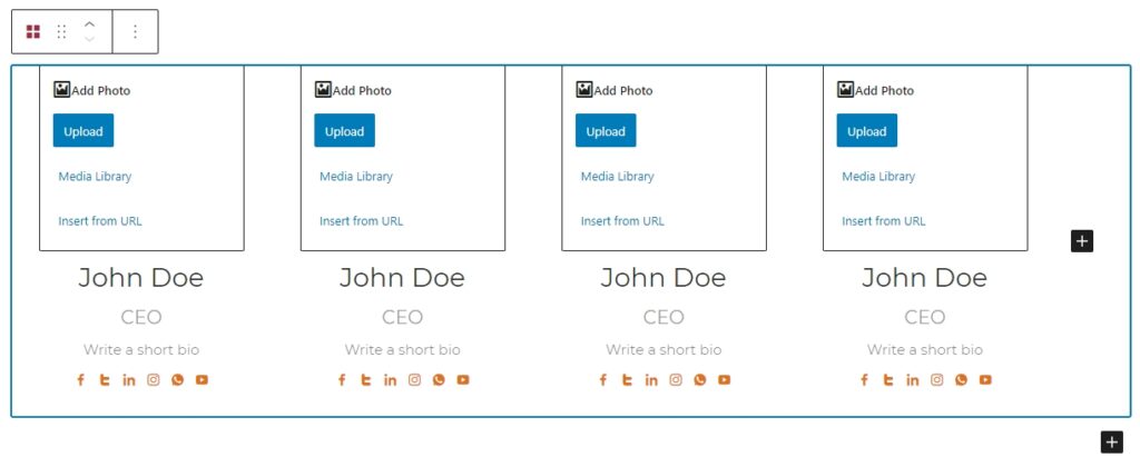
It allows you to add the following information of your team member-
- Photo
- Name
- Position/Title
- Short Bio
- Social Profiles
So, add the necessary information about your team member. If you are not interested in showing any field, simply keep blank that field.
Step-2: Add More Team Members
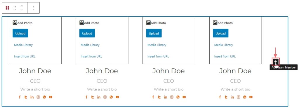
Initially, this block shows only four team members as placeholders. You can either add or remove any team member. To add more team members, simply click on the plus icon (+) or duplicate existing any item.
Step-3: Customize Team Grid View
This block provides some setting options to customize your team grid. If you select the whole team grid, you will find setting options on the right side. It includes two tabs Settings and Typography.
Settings tab offer the following customization options for the team grid view-
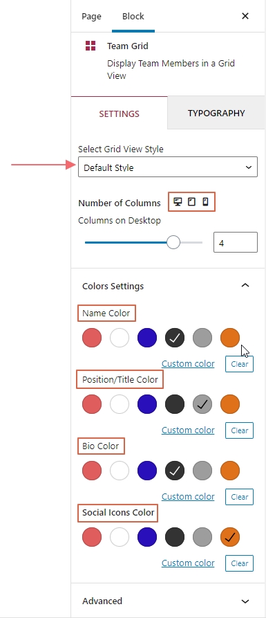
- Grid Style: 3 different grid styles are available right now. These are default, side by side, and hover style. Check out each style and select your expected one.
- Column Setting: Set the different numbers of columns of different devices like desktop, tablet, and mobile.
- Color Settings: Set custom colors for different team member fields like name, title, bio, social icons, etc.
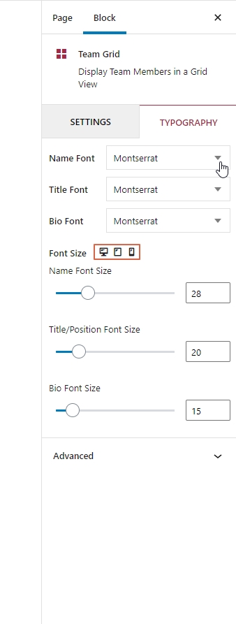
The typography tab offers the ability to pick the custom font size and font family for different team member fields like name title, and bio. You can easily pick font properties for these fields.
Step-4: Publish Your Team Members
Once you finish the customization, now it is time to publish your first team members’ grid view in Gutenberg block editor. I am showing you an example that has been made using this block. You may check out more demos to understand the expected outlooks from this block.